Step 1: Grab the prompt (MotionSites)
Open motionsites.ai/?prompt=skyelite-hero and hit Copy full prompt.
The library has 400+ of these, sorted by section type — heroes, pricing, footers, full landing pages. This one is SkyElite, a private jet hero with a video background.
Step 2: Build it (Claude)
Paste the prompt into Claude and let it run. It ships the hero, the nav, the mobile menu and the animation timing in one pass.
Create a premium private jet landing page hero section with the following specifications:

VIDEO BACKGROUND
- Use your own hosted video URL
- Video should autoplay, be muted, loop continuously, and include playsInline
- Video covers entire viewport (100vh) using object-cover

NAVIGATION BAR
- Brand name "SkyElite" on the left (text-2xl, font-semibold, text-gray-900)
- Desktop menu items (hidden on mobile, visible md:flex): Start, Story, Rates, Benefits, FAQ
- Navigation links in gray-900 with hover:text-gray-700 transition
- Mobile hamburger menu button using Lucide React icons (Menu/X)
- Mobile menu appears as dropdown with white/95 opacity background, backdrop blur, rounded corners, shadow
- Max width 7xl, centered with px-8 py-6

HERO CONTENT (centered, -mt-80 to pull up)
- Small uppercase label: "PRIVATE JETS" (text-sm, font-semibold, gray-600, tracking-wider, mb-4)
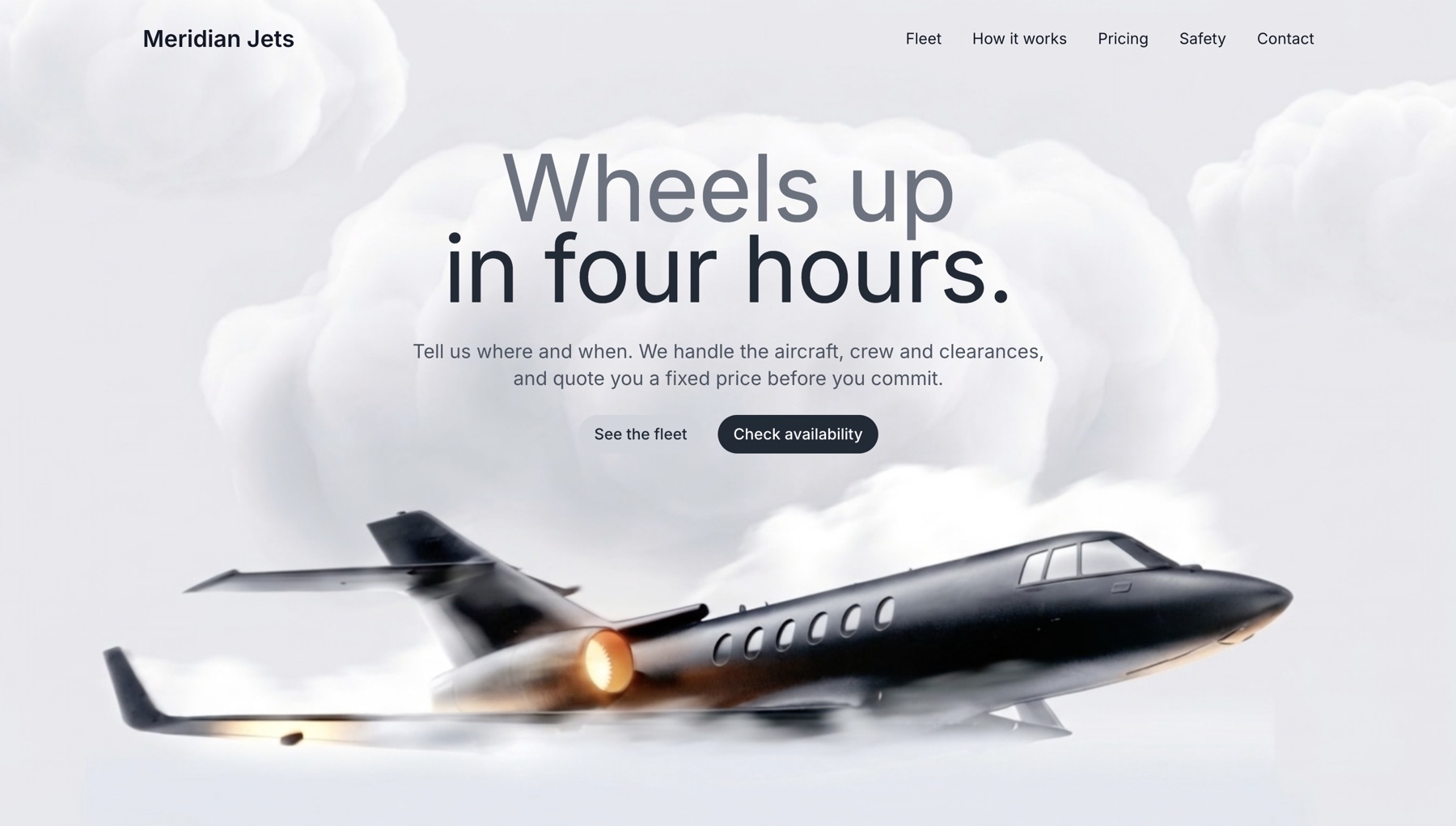
- Large two-line heading with overlapping effect: Line 1: "Premium." (text-6xl md:text-7xl lg:text-8xl, font-normal, text-gray-500, leading-none, tracking-tighter) Line 2: "Accessible." (same size, color #202A36, negative margin-top -12px for overlap)
- Subtitle: "Your dedication deserves recognition." (text-lg md:text-xl, gray-600, mb-6, max-w-2xl)
- Two call-to-action buttons (gap-4, centered): "Discover": px-4 py-2, rounded-full, bg-gray-300, text-gray-800, font-medium, hover:bg-gray-400 "Book Now": px-4 py-2, rounded-full, white text, bg #202A36, hover #1a2229, smooth transitions

TYPOGRAPHY
- Inter font (Google Fonts: 400, 500, 600, 700), applied to body via CSS

TECHNICAL SETUP
- React with TypeScript
- Tailwind CSS
- Lucide React for icons
- useState hook for mobile menu toggle
- Full screen height container (h-screen)
- Responsive breakpoints: mobile-first, md, lg
- All transitions use transition-colors

LAYOUT STRUCTURE
- Outer container: min-h-screen, bg-gray-50
- Hero section: relative, h-screen, overflow-hidden
- Content wrapper: relative, h-full, flex flex-col
- Main content area: flex-1, flex items-center justify-center

Make it clean, modern, and premium-looking with smooth interactions.
The overlapping heading is what sells it — two lines at the same size, the second pulled up 12px so the descender of the first sits behind it. Keep that even if you change everything else.
Step 3: Make it yours
Swap three things and it stops looking like a template:
- The video. Generate your own in Google Flow or Runway, or pull a clip from Pexels, and host it yourself. Do not point at someone else's CDN — it will rotate, break, or bill them
- The two-word headline. Keep the overlap, change the words. Two words, one full stop each
- The accent colour (#202A36). Everything else is greyscale, so this single value is the whole brand
Then run it again with your changes in the same prompt rather than editing the output by hand — it's faster and the spacing stays consistent.