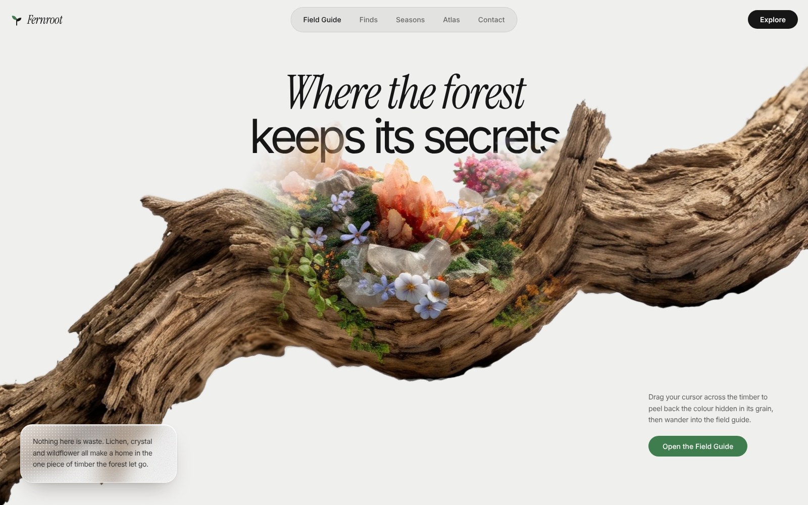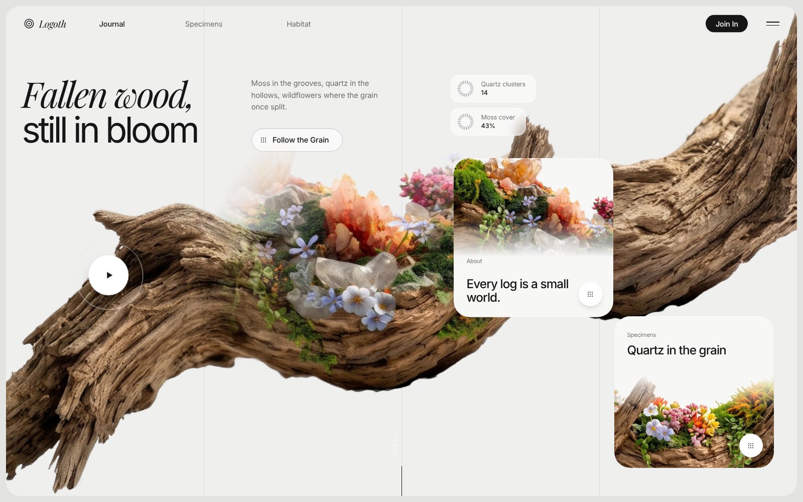
A one-screen hero with no video and no libraries: two stacked images of the same log, a hard-edged round brush that carries the plain log across the screen in a second, and a soft cursor circle that lets the colour layer show through. Everything else (headline, chips, cards, play button) staggers in around it.
Nothing to attach. The prompt links the four images straight from thinkingods.com, so just paste it, save what your AI gives back as
index.html and open it in Chrome. See the live build ↗ first. Want everything offline? Download the images, put them in an assets/ folder and change the four image URLs to assets/base.webp, assets/reveal.webp, assets/card1.webp and assets/card2.webp.The prompt
Paste this into Claude (or any AI that writes code), save the file it gives you as index.html and open it. Nothing to install, no server.
Build ONE self-contained file: index.html. No build step, no npm, no framework, no Tailwind, no JS libraries. Everything lives in a single document: inline <style>, inline SVG icons and vanilla JavaScript. The only things loaded from outside are two Google Fonts and four images hosted on thinkingods.com (listed below). The page is a single full-screen hero for a fictional nature-journal studio called LOGOTH. <title>: "Logoth". Language: en.

IMAGES (hosted: use these exact URLs, never generate, redraw or substitute them)
LOG_PLAIN   https://thinkingods.com/demos/logoth-hero/assets/base.webp     2752x700, transparent, a weathered driftwood log
LOG_COLOUR  https://thinkingods.com/demos/logoth-hero/assets/reveal.webp   2752x700, the SAME log with moss, quartz and wildflowers growing on it. Identical crop and framing to LOG_PLAIN, so the two lie exactly on top of each other
CARD_1      https://thinkingods.com/demos/logoth-hero/assets/card1.webp    600x520, flowers and quartz close-up
CARD_2      https://thinkingods.com/demos/logoth-hero/assets/card2.webp    600x370, wildflowers on wood
Plain <img src="..." decoding="async"> tags. No crossorigin attribute, no lazy loading.

FONTS
<link rel="preconnect" href="https://fonts.googleapis.com"> and <link rel="preconnect" href="https://fonts.gstatic.com" crossorigin>, then the stylesheet https://fonts.googleapis.com/css2?family=Inter:wght@300;400;500;600&family=Playfair+Display:ital,wght@1,400;1,500&display=swap
Inter = all UI text and the second headline line. Playfair Display italic = the logo word and the first headline line.

TOKENS (:root)
--frame:#e3e3e1;  --bg:#efefee;  --ink:#161616;  --ink-soft:rgba(22,22,22,.62);  --line:rgba(22,22,22,.085);  --card:#f7f7f6;  --out:cubic-bezier(.16,1,.3,1)
Reset: *{box-sizing:border-box;margin:0;padding:0}  html,body{height:100%}
body{background:var(--frame);font-family:Inter,system-ui,sans-serif;color:var(--ink);letter-spacing:-.01em;padding:12px;-webkit-font-smoothing:antialiased;overflow:hidden}

STAGE
<main class="hero" id="hero"> fills the body: position:relative; height:100%; border-radius:28px; overflow:hidden; background:var(--bg); container-type:size; isolation:isolate; touch-action:none.
It is a size container, so EVERY position and size inside it uses cqw / cqh and the composition scales with the stage. Custom properties on .hero:
--log-w:max(163.45cqw,118cqh);  --log-x:43.62cqw;  --log-y:49cqh;  --log-rot:-16.6deg;  --tx:0px;  --ty:0px;
--r:clamp(150px,23.2cqw,460px);  --mx:-9999px;  --my:-9999px;   (cursor reveal radius and position)
--ox:0px;  --oy:0px;  --or:0px;  --oi:0px;   (intro brush, set by JS)
Everything that animates in starts at opacity:0 (class .a) and is released when .is-playing is on #hero. Removing and re-adding .is-playing restarts every CSS animation (this is how replay works).

GRID LINES
<div class="grid" aria-hidden="true"> with three <i>: position:absolute; top:0; bottom:0; width:1px; background:var(--line); z-index:0; transform-origin:top; opacity:0. left:25%, 50%, 75%. Animation line-in 1.8s var(--out) both, delays .05s / .18s / .31s. @keyframes line-in{from{opacity:0;transform:scaleY(0)}to{opacity:1;transform:scaleY(1)}}

NAV (z-index 20)
.nav: position:absolute; inset:0 0 auto 0; height:70px; font-size:max(.74rem,.92cqw). Every child is position:absolute; top:50%; translate:0 -50%.
Brand (a <button id="replay" class="brand a" aria-label="Logoth, replay intro">): left:2.2cqw; flex, gap 9px; no background/border; inside it a 22x22 inline SVG logo (a log cross-section: viewBox 0 0 24 24, fill none, stroke #161616, stroke-width 1.6, circle cx12 cy12 r9.5, circle r5.5, and a filled dot r1.7) and the word "Logoth" in Playfair Display italic, font-size 1.35em, letter-spacing -.02em.
Links (<a class="link a">): "Journal" (active: color var(--ink), weight 500), "Specimens", "Habitat". colour var(--ink-soft), no underline, transform:translateX(-50%) so they centre on their anchor; left:13.4% / 25% / 37%. Hover colour var(--ink).
"Join In" (<a class="join a">): right:6.2cqw; weight 500; white text on var(--ink); padding .62em 1.35em; border-radius 999px; hover background #333.
Burger (<button class="burger a" aria-label="Open menu">): right:2.2cqw; 26x12px; two 1.5px var(--ink) bars made with ::before (top:2px) and ::after (bottom:2px).
Nav items drop in: animation drop .9s var(--out) both, @keyframes drop{from{opacity:0;margin-top:-12px}to{opacity:1;margin-top:0}}. Delays: brand .1s, links .22s/.3s/.38s, Join In .3s, burger .38s.

HEADLINE (z-index 10)
<h1 class="h1" aria-label="Fallen wood, still in bloom">: position:absolute; left:2cqw; top:14cqh; font-size:max(2.3rem,4.5cqw); line-height:1.04; font-weight:400. Two block rows, white-space:nowrap, both aria-hidden: row 1 "Fallen wood," in Playfair Display italic, letter-spacing -.045em; row 2 "still in bloom" in Inter, letter-spacing -.07em.
JS splits each row into one <span class="ch"> per character (spaces stay as text nodes) and gives every span --i = a running counter across both rows. .ch{display:inline-block;opacity:0}. .is-playing .ch{animation:ch-in 1.1s var(--out) calc(.28s + var(--i) * .034s) both}
@keyframes ch-in{from{opacity:0;transform:translateY(.38em);filter:blur(8px)}to{opacity:1;transform:none;filter:blur(0)}}

COPY + CTA (z-index 10)
.copy: position:absolute; left:31cqw; top:14.6cqh; width:18cqw.
Lede (.lede.a): "Moss in the grooves, quartz in the hollows, wildflowers where the grain once split." font-size:max(.72rem,.95cqw); line-height 1.55; colour var(--ink-soft). Animation rise 1.1s var(--out) .95s both. @keyframes rise{from{opacity:0;transform:translateY(14px)}to{opacity:1;transform:none}}
CTA (<a class="cta" href="#">): margin-top:2cqw; inline-flex; align-items:center; gap 12px; padding .8cqw 1.7cqw .8cqw 1.1cqw; border-radius 999px; border:1px solid rgba(22,22,22,.22); font-size:max(.72rem,.95cqw); weight 500; colour var(--ink); no underline; background rgba(255,255,255,.62); backdrop-filter blur(10px) (with -webkit- prefix); hover background #fff and border rgba(22,22,22,.4). Inside: a 12x12 3x3 dot-grid SVG (nine circles r=1 at 2/6/10 on a 12x12 viewBox, fill currentColor) and <span>Follow the Grain</span>.
Reveal: clip-path:inset(0 100% 0 0 round 999px) → inset(0 0 0 0 round 999px), animation cta-in 1.2s var(--out) 1.15s both. The label span starts opacity:0 and fades in with fade .8s ease-out 1.55s both. @keyframes fade{from{opacity:0}to{opacity:1}}

THE LOG (z-index 2). This is the whole point of the page.
<div class="log-stage" id="stage"> contains two layers; each layer holds one .log with one <img>:
  <div class="layer"><div class="log"><img LOG_PLAIN alt="Weathered driftwood log"></div></div>
  <div class="layer reveal"><div class="log"><img LOG_COLOUR alt=""></div></div>
CSS, exactly:
.log-stage{position:absolute;inset:0;z-index:2;pointer-events:none;
  -webkit-mask-image:radial-gradient(circle at var(--ox) var(--oy),#000 var(--oi),transparent var(--or)),linear-gradient(90deg,transparent var(--ox),#000 calc(var(--ox) + 1px));
          mask-image:(the same two layers)}
.log-stage.done{-webkit-mask-image:none;mask-image:none}
.layer{position:absolute;inset:0}
.log{position:absolute;left:var(--log-x);top:var(--log-y);width:var(--log-w);aspect-ratio:2752/700;
  transform:translate3d(var(--tx),var(--ty),0) translate(-50%,-50%) rotate(var(--log-rot));transform-origin:50% 50%;will-change:transform}
.log img{position:absolute;inset:0;width:100%;height:100%;display:block;user-select:none;-webkit-user-drag:none}
.reveal{-webkit-mask-image:radial-gradient(circle var(--r) at var(--mx) var(--my),#000 0,#000 40%,rgba(0,0,0,.75) 60%,rgba(0,0,0,.4) 75%,rgba(0,0,0,.12) 88%,transparent 100%);
        mask-image:(the same)}
So: the plain log is always visible. The colour log sits exactly on top of it but only shows inside a soft circle that follows the cursor. The log is rotated -16.6deg and is much wider than the stage (about 163% of its width), so it runs diagonally from bottom-left to top-right and is cropped on both sides. The log sits BEHIND the headline, copy, play button, chips and cards (stage z-index 2; those are at 10-12): their positions are chosen so the text lives in the empty sky above the log and the cards float over the wood.

INTRO + MOTION (JS). One requestAnimationFrame loop does everything. Constants, named exactly:
AXIS = -16.6deg in radians; AX = cos(AXIS); AY = sin(AXIS)   (all log motion runs along the log's own diagonal)
SLAB_MS = 300; SLAB = 0.5; GROW_MS = 700; CY = 0.50; RK = 0.56; EDGE_PX = 1.5
DRIFT = 0.205; DRIFT_MS = 25000; REV_LERP = 0.10
Helpers: clamp(v,a,b); easeOut(t,p) = 1 - (1 - t)^p; setVar(k,v) writes a CSS variable on #stage only when the value changed (keep a cache).
measure(): W = hero.clientWidth; H = hero.clientHeight; BR = RK * H (brush radius, constant); D1 = SLAB * W; D2 = (1 - SLAB) * W + BR; V2 = 2.2 * D2 / GROW_MS; set --oy = CY * H px; set --or = BR px; set --oi = max(0, BR - EDGE_PX) px. Call on load and on resize.

1) The brush. The intro mask on .log-stage is ONE circle of constant radius BR with a hard edge (the gradient has a single stop, no feather, no fade) plus a rectangle that fills everything to the right of the circle's centre. It exists at 100% opacity from the very first frame, just off the right edge of the stage, so nothing fades in or grows from zero. Its leading (left-most) edge sweeps right to left:
travel(t) = distance the leading edge has moved left of the stage's right edge:
  if t <= SLAB_MS: a = 2*D1/SLAB_MS - V2; b = (V2*SLAB_MS - D1)/SLAB_MS^2; return a*t + b*t*t      (reaches exactly the middle of the stage at 0.3s, with exactly the speed the next phase starts at, so there is no pause)
  else: p = clamp((t - SLAB_MS)/GROW_MS, 0, 1); return D1 + D2 * easeOut(p, 2.2)                    (keeps going left for 0.7s until the circle's centre has left the stage and the whole log is revealed)
Brush centre x = W - travel(t) + BR, written to --ox every frame; --oy stays at CY*H. When t >= SLAB_MS + GROW_MS add class "done" to #stage (this removes the mask). The result: the log appears from the right, covering half the screen in 0.3s with a big hard round edge, and the same round edge carries on across to the left. Total intro 1.0s.
2) The slide. At the same time the log itself travels with the brush: ps = easeOut(clamp(t/SLAB_MS,0,1), 3); slide = (1 - ps) * (SLAB / AX).
3) The drift. After the intro the log keeps creeping right to left along its axis, very slowly, and eases to a stop: drift = sin(clamp(t/DRIFT_MS,0,1) * PI/2) * DRIFT.
dist = (slide - drift) * W (use 0 if prefers-reduced-motion). --tx = dist*AX px; --ty = dist*AY px (both on #stage).
4) Cursor reveal. Listen to pointermove on window (passive). First move: snap m.x/m.y to the pointer. Always: target = clientX/clientY. Each frame m.x += (target.x - m.x) * REV_LERP, same for y, and write --mx / --my on #stage (clientX/clientY are used as they are). Because the colour layer's .log shares the same --tx/--ty as the plain one, the colour stays locked to the wood while the log drifts and the circle follows the cursor.
5) Touch devices (matchMedia('(hover: none)')): until the first pointer event, 600ms after the intro finishes, drive the target by itself: x = W * (0.5 + 0.30 * sin(now/1500)); y = H*0.49 + (x - W*0.4362) * tan(AXIS). This makes the reveal sweep along the log on its own.
Start: wait for every image .decode() and for document.fonts.ready, but never longer than 900ms for the fonts (race them), then in requestAnimationFrame call play(). play(): remove .is-playing from #hero, force reflow (void hero.offsetWidth), add .is-playing, then logIntro(): measure(); t0 = performance.now(); doneAt = 0; remove "done"; set the brush to travel 0; set --tx/--ty to the full slide offset (SLAB/AX*W along the axis); start the rAF loop once. Both the brand button (#replay) and the play button (#play) call play().

PLAY BUTTON (z-index 10)
<button class="play" id="play" aria-label="Replay intro animation">: position:absolute; left:13cqw; top:55cqh; translate:-50% -50%; width/height 8.6cqw with min 76px; display:grid; place-items:center; no background/border. Inside: <span class="ring"> (position:absolute; inset:0; border-radius:50%; border:1px solid rgba(255,255,255,.75); box-shadow 0 0 0 1px rgba(0,0,0,.06)) and <span class="dot"> (5.1cqw square, min 56px, round, solid white, box-shadow 0 14px 30px -12px rgba(30,20,10,.55), centred play triangle SVG 16x16 path "M3 1.5v13l11-6.5z" fill #161616, margin-left 3px). Hover: dot scales to 1.07 (transition transform .35s var(--out)).
Animations: dot pop 1.1s var(--out) 1.25s both (from opacity 0, scale .2 to 1); ring 1.4s var(--out) 1.4s both (from opacity 0, scale .55 to 1); triangle fades in .6s ease-out 1.75s.

STATS (two frosted chips, z-index 10)
.stat: position:absolute; flex, align-items:center, gap .9cqw; font-size:max(.68rem,.8cqw); line-height 1.35; padding .6cqw 1.3cqw .6cqw .8cqw; border-radius 16px; background rgba(255,255,255,.55); border 1px solid rgba(255,255,255,.75); backdrop-filter blur(10px).
Each holds a 28x28 SVG ring (circle cx14 cy14 r11, fill none, stroke rgba(22,22,22,.45), stroke-width 5, stroke-dasharray 1.1 2.2; width 2.1cqw, min 24px) that spins forever (spin 18s linear infinite), and a block: <small> label in var(--ink-soft) over <b> value in weight 500.
stat1 (left:56.2cqw; top:14cqh): "Quartz clusters" / "14". stat2 (left:56.2cqw; top:20.8cqh): "Moss cover" / "43%". Animation rise 1.1s var(--out), delays 1.45s and 1.6s.

CARDS (z-index 12)
.card: position:absolute; overflow:hidden; background var(--card); border-radius:2cqw; box-shadow 0 1px 0 rgba(255,255,255,.8) inset, 0 30px 60px -28px rgba(30,30,25,.35); hover translate 0 -5px (transition translate .5s var(--out)). Initial clip-path:inset(47% 14% 47% 14% round 999px) (a small pill in the centre).
Animation card-in 1.4s var(--out) both: 0% opacity 0 + the pill clip; 10% opacity 1; 100% opacity 1, clip-path:inset(0 0 0 0 round 2cqw). The card's <img> and its .in text layer start opacity 0 and fade in (fade .9s ease-out) 0.65s after the card starts.
card1 (left:56.6cqw; top:31cqh; width:20.2cqw; height:32.5cqh), delay .85s, CARD_1: image absolute top:0, full width, height 62%, object-fit cover, object-position 50% 40%, faded to transparent at the bottom with mask linear-gradient(#000 62%,transparent). Tag "About" (left 8%, bottom 33%, font-size max(.62rem,.72cqw), var(--ink-soft)); title "Every log is a small world." (left 8%, right 22%, bottom 8%, font-size max(1rem,1.55cqw), line-height 1.12, weight 500, letter-spacing -.04em).
card2 (left:76.9cqw; top:63.3cqh; width:20.2cqw; height:31cqh), delay 1.02s, CARD_2: image absolute bottom:0, height 62%, object-position 50% 60%, mask linear-gradient(to top,#000 62%,transparent). Tag "Specimens" (left 8%, top 10%); title "Quartz in the grain" (top 18%).
Each card has a round white chip button bottom-right (right 7%, bottom 7%, 3cqw square, min 34px, box-shadow 0 6px 16px -8px rgba(0,0,0,.35), hover scale 1.1) holding the same 12x12 dot-grid SVG in #161616. aria-label="Open".

SCROLL CUE
.scroll: absolute, left:50%, bottom:0, z-index 10. A vertical word "SCROLL" (writing-mode vertical-rl, font-size .56rem, letter-spacing .34em, white with mix-blend-mode:difference, left -18px, bottom 7cqh) and a 1px x 6cqh ink line (left -.5px, bottom 0, transform-origin bottom). Word fades in 1s ease-out 2s; line grows (scaleY 0 to 1) 1.2s var(--out) 2s.

RESPONSIVE (max-width:760px)
body padding 8px; .hero radius 22px; hide the three links, Join In, both stats and the scroll cue; brand left 18px, burger right 18px; nav font .8rem; headline left 20px, top 15%, font-size 2.7rem; .hero{--log-y:58cqh}; .copy left 20px, top 28.5%, width 62%; lede .8rem; CTA margin-top 18px, padding 10px 20px 10px 14px, font .8rem; play left 22%, top 60%, min 68px; cards radius 20px, both top:auto; bottom:14px; width calc(50% - 20px); height 21%; card1 left 14px; card2 right 14px; card titles .95rem, tags .62rem; chips 30px. card-in's final clip radius becomes 20px.

ACCESSIBILITY
Headline has an aria-label with the full sentence and the visual rows are aria-hidden. The decorative layers (grid, colour log, rings, scroll cue) are aria-hidden or have empty alt. @media (prefers-reduced-motion:reduce): all animations run at .01ms with no delay, the stat rings stop spinning, the intro mask is skipped (add "done" immediately) and the log does not drift (dist = 0).

FALLBACKS
If an image has not decoded, the page still starts after the fonts race. If the fonts do not load within 900ms the intro starts anyway with system fonts.

DONE WHEN
1) On load the log wipes in from the right: a big hard-edged round brush crosses half the screen in 0.3s and carries on to the left in a further 0.7s, with no pause, no flash and no soft edge anywhere. 2) Afterwards the log creeps slowly from right to left, about 20% of the width, and stops. 3) Moving the mouse over the wood uncovers the moss, quartz and flowers inside a soft circle that follows the cursor with a slight lag, and stays locked to the wood while it drifts. 4) Headline letters, copy, chips and cards stagger in as listed. 5) Clicking the play button or the logo replays the whole thing from the start. 6) On a 390px-wide phone the layout matches the responsive block and the reveal sweeps by itself.
Make it yours
| Swap | How |
|---|---|
| Your own name and words | Change the brand, headline, lede, the two chips and the two card titles. The logo is a small inline SVG in the nav, so swap that too. |
| Your own object | Replace the two log images with any cut-out plus a coloured version of it, same size and same framing (transparent WebP or PNG). Then adjust --log-w, --log-x, --log-y and --log-rot to pose it. |
| Your own timing | Edit the named constants: SLAB_MS and GROW_MS for the entrance, DRIFT and DRIFT_MS for the slow creep, --r for the size of the reveal circle. |